


It’s a crowded market for chart libraries, yet a surprising number of teams still choose one that doesn’t hold up. The issue isn’t usually technical ability on the team’s side — it’s baked into how these tools get evaluated.
People fixate on feature lists and slick demo visuals, but pay less attention to what happens when real production traffic hits. A library that looks perfect with small datasets can slow down or break at larger ones. For real-time work, you need fast latency, GPU acceleration, and good memory management, but those factors seldom make it into the reviews.
We put seven libraries through their paces for complex, interactive dashboards. Our ranking focused on actual rendering speed, variety of charts, how well they integrate with frameworks, enterprise support, and accessibility. In the end, the difference between marketing claims and real-world performance is noticeable.
Here’s how the top 7 compare at a glance:
| Firm | Chart Types & Features | Framework Support | Best For | Licensing Model |
| SciChart | Real-time, financial, 3D charts | WPF, React, iOS, Android | High-frequency trading, scientific apps | Commercial license |
| amCharts | 60+ types, maps, Gantt | Vanilla JS, React, Angular | Enterprise dashboards, accessibility focus | Free + Commercial |
| Highcharts | Stock, maps, Gantt, grid | React, Vue, Angular | Multi-format business intelligence suites | Free + Commercial |
| Fusioncharts | 95+ charts, 1400+ maps | React, Angular, Vue | Rapid deployment, geographic data | Commercial license |
| Plotly | 40+ scientific charts, 3D | Python, R, JavaScript, React | Data science apps, AI analytics | Open-source + Cloud |
| Chart.js | 8 core types, mixed charts | Framework-agnostic | Simple dashboards, small projects | Open-source MIT |
| WebDataRocks | Pivot tables, drill-down | Framework-agnostic | Analytical reports, data exploration | Completely free |
Best Chart Libraries For Interactive Dashboards
Selecting the right charting library can make or break your dashboard’s usability, performance, and development velocity—here’s how the top contenders compare across real-world use cases.
SciChart
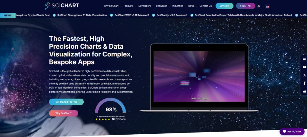
SciChart first appeared back in 2012 with its own Vx™ GPU-accelerated engine. It was built to tackle a real issue that most charting libraries tend to overlook: how quickly performance falls apart with heavy real-time data.
SciChart renders hundreds of millions of data points at 60 FPS with no dropped frames, whereas competing libraries typically degrade beyond 10,000 points. This performance difference results from offloading rendering to the GPU, which preserves CPU capacity for application logic. That means you still get responsive interactions even when streaming live sensor readings, financial ticks, or scientific data.
It also runs across multiple platforms, including WPF, JavaScript/React, iOS, macOS, and Android. That makes it a strong fit for enterprise dashboards that need the same high performance on desktop, web, or mobile. SciChart shines in demanding areas like trading platforms, medical devices, aerospace systems, and industrial IoT — places where any lag is simply not acceptable.
Key strength:
- GPU-accelerated Vx™ engine handles 100M+ data points at 60 FPS
- Cross-platform: WPF, JavaScript, React, iOS, macOS, Android
- Real-time streaming charts with zero frame drops
- Built for financial, scientific, and industrial dashboards
- Commercial licensing with enterprise support tiers
Why Choose This Library?
SciChart is the right pick when you can’t afford any performance issues. Whether you’re displaying real-time market data for dozens of assets, streaming data from many sensors, or working with scientific datasets that refresh quickly, its GPU rendering keeps the interface responsive and stable.
It integrates well with React for modern web projects. Yes, it’s pricier than some alternatives, but for dashboards where delays have real consequences, the investment usually saves time and headaches later.
amCharts
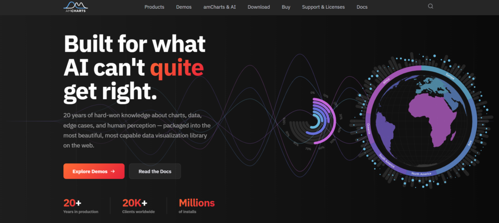
amCharts has been around since 2006, bringing nearly 20 years of data visualization experience. It offers over 60 chart types — including financial charts, Gantt, and interactive maps — so you can cover stock tickers to project timelines without extra libraries.
Its Canvas rendering keeps things smooth with large datasets, avoiding the slowdowns common in SVG tools. It handles hundreds of thousands of data points reliably, making it great for real-time dashboards that need quick drill-downs and zooming.
Accessibility is built in, and it’s trusted by over 20,000 companies. Overall, it balances solid stability with strong customization options.
Key strength:
- 60+ chart types cover financial, geospatial, and project management use cases
- Canvas rendering maintains 60 FPS with 500K+ data points
- Accessibility features pass WCAG 2.1 AA without manual configuration
- Responsive design adapts charts to mobile and desktop viewports
- TypeScript definitions and React wrappers for modern framework integration
Why Choose This Library?
Choose amCharts when you need chart variety and accessibility without sacrificing performance. The Canvas engine scales better than pure SVG competitors, and the built-in ARIA support eliminates weeks of compliance work.
It’s production-ready for dashboards serving diverse audiences—from financial analysts to executive stakeholders who navigate with assistive technology.
Highcharts
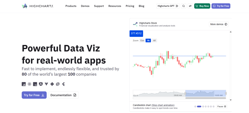
Highcharts plays nicely with React and other current frameworks, keeping integration simple for component-driven projects. Its accessibility features are part of the original design, which helps a lot when you need to meet strict compliance standards.
Coverage for mobile and web feels native. The Dashboards tool brings multiple chart types together into one view without complicated custom code. Financial teams appreciate the built-in stock charts with zooming and range selection. Maps and Gantt charts round things out, so you don’t have to pull in extra libraries for most projects.
Key strength:
- Comprehensive suite spans Core, Stock, Maps, Gantt, Grid, Dashboards
- React and modern framework integration without wrapper friction
- Accessibility compliance built into core design, not retrofitted
- Mobile-responsive rendering across web and native platforms
- Time-series and financial chart types with production-grade features
Why Choose This Library?
Highcharts suits teams looking for a reliable, multi-format charting library that sits comfortably between lightweight options and heavy specialized tools. It delivers solid performance without unnecessary overhead.
The built-in accessibility support makes it especially suitable for public and enterprise environments where WCAG compliance matters. Good framework integration means less rework when your tech stack evolves, and the overall suite reduces the need to maintain several different charting libraries.
Fusioncharts
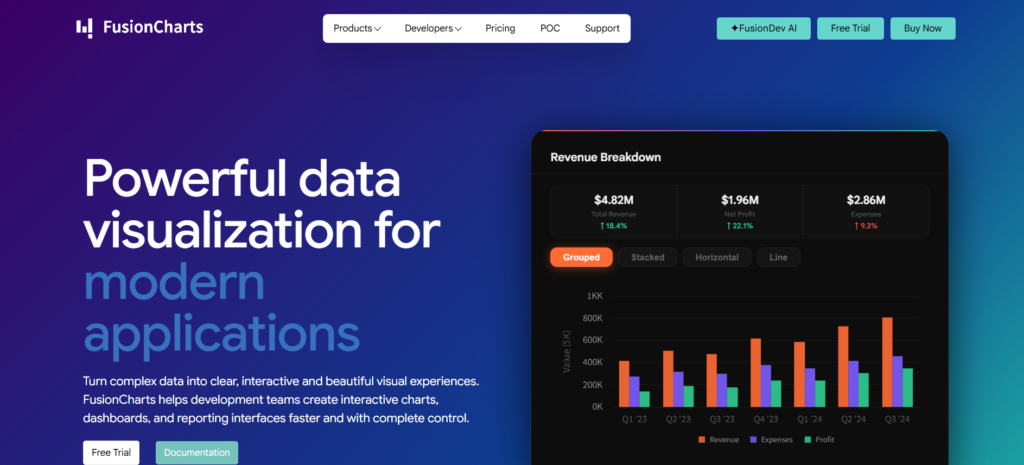
FusionCharts is a strong pick for teams that want a wide range of charts without complicated setup. It comes with over 95 chart types and 1,400 maps, covering everything from basic bars and lines to more advanced options like Sankey diagrams, treemaps, and real-time gauges. That variety means you rarely need to combine multiple libraries as your dashboard grows.
It also includes twenty pre-built dashboards, which helps teams get interactive prototypes up and running in hours instead of weeks. The integration with React and Angular is smooth, so you can add components with very little extra code. No custom wrappers or tricky state management needed.
The visuals are responsive and customizable, looking good on both desktop and mobile. For teams that need plenty of features without slowing down development, FusionCharts hits the right balance.
Key strength:
- 95+ chart types including Sankey, treemap, and real-time gauges
- 1400+ map visualizations for global data representation
- 20+ dashboard templates for rapid prototyping
- Native React/Angular wrappers with zero-friction integration
- Responsive design adapts to desktop and mobile viewports
Why Choose This Library?
Pick FusionCharts if your dashboards require many chart types without integration issues. It covers most needs for financial tools, logistics, or multi-tenant platforms with ready-made, documented visualizations.
The pre-built dashboards speed up prototyping and stakeholder reviews. In React or Angular, components drop in easily using props and standard callbacks. This reduces setup time and helps keep code clean as complexity increases.
Plotly
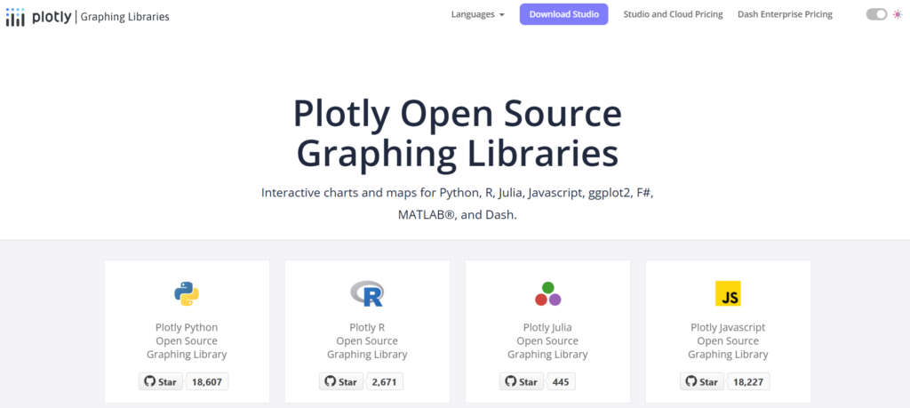
Plotly bridges the gap between community-driven charting libraries and enterprise-grade analytics platforms, delivering both flexibility and power for data-intensive dashboards. Battle-tested open-source graphing libraries form Plotly’s foundation, trusted by millions of developers worldwide for interactive visualizations across Python, R, and JavaScript.
The Dash framework for building full data applications elevates Plotly beyond simple charting into a complete ecosystem for deploying production dashboards with callbacks, state management, and server-side rendering—eliminating the need to stitch together disparate tools for complex analytical interfaces.
Plotly Studio with AI-native agentic analytics represents the next evolution, embedding intelligent query assistance and automated insight generation directly into the visualization workflow. Organizations gain cloud publishing and enterprise self-hosted options, balancing convenience with data sovereignty requirements that matter in regulated industries.
Key strength:
- Open-source libraries with commercial enterprise support tiers
- Dash framework enables full-stack Python dashboard development
- AI-powered Studio for automated analytics workflows
- Multi-language support: Python, R, JavaScript, Julia
- Self-hosted or cloud deployment flexibility
Why Choose This Library?
Plotly works well when you need reliable open-source foundations along with enterprise extras like collaboration and analytics tools. For teams in Python or R, Dash is particularly useful — it converts Jupyter notebooks into production web apps with almost no JavaScript required.
Its AI-powered Studio adds intelligent exploration features that competitors lack. This makes it much easier to find insights in complex data without configuring every view by hand.
Chart.js
Chart.js is a community-driven open-source project that gives you eight main chart types using HTML5 Canvas. It’s not built for millions of real-time points, but it shines with dashboards that show thousands of records using clean, responsive visuals.
You get responsive layouts and smooth animations out of the box, which works especially well for internal tools, admin dashboards, and fast-moving MVPs. It also lets you mix chart types—like bars with lines or scatters—and supports custom scales without extra dependencies.
Because it’s free and framework-agnostic, it drops easily into React, Vue, or vanilla JS projects. Startups and open-source teams love the lack of licensing costs and lock-in. The downside is that you manage updates on your own, and community support, while helpful, doesn’t match paid vendors’ SLAs. Overall, it strikes a smart balance for moderately complex dashboards that stay under 10,000 data points.
Key strength:
- 8 chart types including line, bar, radar, doughnut, polar area
- HTML5 Canvas rendering with zero external dependencies
- Plugin architecture for tooltips, legends, and custom interactions
- Fully responsive with automatic chart resizing
- Active GitHub community with 65k+ stars
Why Choose This Library?
Chart.js suits dashboards with under 10,000 data points and infrequent updates. Quick to learn, framework-agnostic, and free. For high-frequency or sub-100ms performance needs, choose GPU-accelerated libraries instead.
WebDataRocks
WebDataRocks is a smart choice when dashboard work centers on exploring multidimensional data instead of rendering huge real-time loads. Founded back in 2008, it provides completely free pivot table tools that many commercial libraries keep behind paywalls.
You get solid support for filtering, grouping, conditional formatting, and exporting to common formats. Teams building financial reports, sales dashboards, or operational analytics love how easily users can pivot, drill down, and reorganize data on the spot.
It scales nicely to tens of thousands of rows, and integration is simple whether you’re using React, Angular, Vue, or plain JavaScript. No heavy setup or lock-in required.
Key strength:
- Zero licensing fees for unlimited commercial use
- Drill-through hierarchies with conditional formatting rules
- Export aggregated views to Excel/PDF/CSV formats
- Framework-agnostic embedding with JSON data binding
- Active community forum for troubleshooting integration issues
Why Choose This Library?
Go with WebDataRocks if your dashboards prioritize data exploration over advanced visuals. Its free commercial license, pivot table support, and features like filtering, grouping, and drill-downs work well for BI dashboards, financial reporting, sales analytics, and operational tools.
It’s especially appealing for teams that want familiar spreadsheet-like interaction without paying for heavy enterprise software.
Conclusion
Picking the right chart library comes down to matching it with your actual workload, not just going with whatever is most popular. The options we looked at sit at different points on the spectrum — some use GPU acceleration for live streaming data, while lighter open-source tools work fine for internal reports with smaller datasets.
Framework compatibility, accessibility, licensing costs, and pivot table needs all play a role. No single library wins in every situation. The best approach is to list your must-have requirements — data volume, update frequency, target platforms, and team skills — then test the candidates with your own data and real usage patterns instead of relying on vendor demos.


Leave a Reply
You must be logged in to post a comment.