


PEER LEARNING
You learn programming by collaborating with other students. Projects are evaluated through peer review.
PROJECT BASED LEARNING
Learn by doing. The curriculum consists of high quality and up-to-date projects which are constantly innovated by a group of experts.
REAL-WORLD SKILLS
Develop soft skills needed in working life such as adaptability, critical thinking, collaboration and learning to learn.

About Us
Ready To Make a Change
Our school is a hubspot for technology and innovation, with a variety of well-paid tech career opportunities in big companies and exciting startups.
There is a growing ecosystem of people, institutions and communities that can support you if you strive to make an impact! Here you will have access to a library, the canteen and many more educational offerings.
We offer a unique learning space, which students help to design and evolve. Grab a seat at one of our iMac workstations. Take a break up and grab one of the instruments in our music room. Develop your ping-pong or table football skills, join a board game night or attend our partner talks, where our partner companies present internships for our students.
About skill
What to choose
Each project in the curriculum has been designed to learn a particular aspect of programming. By completing projects and mastering your skills you will develop your own unique competences and you will be prepared for diverse challenges and creative opportunities. Let’s dive a little deeper…


HAPPY Students
9052 +

campuses
10 +

YEAR OF EXPERIENCE
5 +
CURRICULUM
SKILLS DEVELOPED DURING YOUR STUDIES
All students share the same starting point on the curriculum map. From there you have the freedom to choose your own path and pace and later your specializations.
GRAPHICS
Light up those pixels and use mathematics to create simulations, visualizations and games.
ALGORITHMS & AI
Take command with calculations, patterns and rules to conquer solved and unsolved problems.

DATABASE & DATA
Explore the techniques needed to analyze large amounts of data and learn how the storage and analysis of data and its application are the foundations and future of technology.

FUNCTIONAL PROGRAMMING
Combine mathematics and programming to create functions for advanced computation.
RUBY
Combine programming paradigms in a dynamic reflective language: Ruby.
WEB
Create new experiences, and recreate existing platforms, sites and applications to better understand them.
TESTIMONIALS
Check Out Some of Our Qualifications
The Designest is a popular design blog that covers a wide range of topics related to graphic design, branding, typography, and more. While the blog mainly focuses on design concepts, it occasionally features articles on drawing software, such as Adobe Illustrator and Procreate.
GetDevDone provides expert AngularJS development services to help businesses build dynamic and responsive web applications.
With capabilities ranging from custom software development to system integration and microservices architecture, .NET development services cater to businesses seeking to modernize their IT infrastructure, streamline processes, and enhance user experiences. By leveraging the .NET ecosystem, companies can benefit from a robust and supportive community, as well as a rich set of development tools that facilitate rapid and efficient application development.
Kronos Training organized by CloudFoundation covers all the aspects related to Kronos Workforce management & HR related topics.

Looking to improve your website’s ranking on Google? Free SEO checker by Sitechecker is just what you need. Not only is it lightning-fast and dependable, but it also conducts a thorough examination of your site, generating a detailed SEO report that includes a tailored list of suggestions for boosting your online presence and dominating search engine results.
Software testing services are essential for ensuring the quality and reliability of software applications. These services encompass a range of activities, including test planning, execution, and reporting, to identify and rectify defects or issues within the software, ultimately improving its performance, security, and user satisfaction.
Elevate your web projects with Innowise Group’s Laravel development services. Our expert team harnesses the full power of Laravel to deliver tailor-made solutions that redefine web development.

AI draws pictures now, creates sitcoms, writes music, and talks to people about complicated topics, but how to use such tech to gain business benefits? ProCoders has prepared a full guide for you.
Our courses
Choose a program
and transform your career
Our programs will teach you everything you need to get your first job in tech in as little as 5 months—even if you don’t have any previous experience.

Full-Stack Web Development Program
- Learn all of the skills, tools, and processes you need to become a web developer
- Work 1:1 with an expert mentor and tutor, who will give personalized feedback and insight into the daily life of a web developer.
- Receive tailored coaching from our Career Services team to ensure you stand out at interviews
- Build an impressive portfolio out of the real-world projects you complete
- Land a job as a web developer within 180 days of graduating from the program—or your money back

UX Design Program
- Learn all of the skills, tools, and processes you need to become a UX designer
- Work 1:1 with an expert mentor and tutor, who will give personalized feedback and insight into the daily life of a UX designer.
- Receive tailored coaching from our Career Services Team to ensure you stand out at interviews
- Build an impressive portfolio out of the real‑world projects you complete
- Land a job as a UX designer with the help of our career specialists
- Become a web developer in under 10 months

Machine Learning and Data Analytics using Python
- Explain the usage of data from insight generation and visualisation to fitting machine learning models using Python
- Understand the data structures in Python
- Extract data from database using SQL
- Write custom functions and codes in Python, and use relevant libraries in Python such as pandas and Numpy to manipulate data
- Perform ETL (Extract Transform Load) processing using data analysis expressions (DAX) to perform calculations
- Align and apply the supervised and unsupervised learning models in Python
Graduate outcomes
Our graduates forge careers they love
Whether you are a complete beginner or a designer looking to upskill, our programs were built to get you the outcome you want.

Career Change to Web Developer: How I Discovered the Reward of Working in Tech
The most rewarding part of a career in web development is the opportunity to create something that can be seen and used by millions, and somehow makes a difference in their lives, for me, is the most rewarding part of a career in web development.

James Watkins
New York
From Teacher to Data Analyst: How I Leveled Up My Math Skills for a Career in Data
It was easy to manage my time, because the exercises came with time estimations and my mentor helped me to stay motivated and stick with my planning throughout the course. Without this school I would not have my new job, and they helped me double my salary from my last job!

Richard H Waldon
London
A unique dual mentorship model:
Learn from the best, every single day
Our dual mentorship model pairs you with not one, but two dedicated experts—your mentor and tutor. And the support doesn’t end there. You’ll also be assigned a student advisor and a career specialist!

Your mentor
A senior in the field with at least 5 years’ experience
They’ll provide detailed feedback on all of your portfolio pieces

Your tutor
A course expert who works in your new field
They’ll answer your day-to-day questions within 24 hours.

Your career specialist
A seasoned coach
They’ll help you with everything from identifying the jobs you want to refining your resume and practicing for interviews.
News & Bolgs
Discover your corner of the tech world.
-

Addressing Cybersecurity Risks in Finance Software: Strategies and Solutions
Introduction: In today’s digital age, the finance sector stands as a beacon of progress, with financial software development companies at the forefront of driving innovations in finance software. […]
-
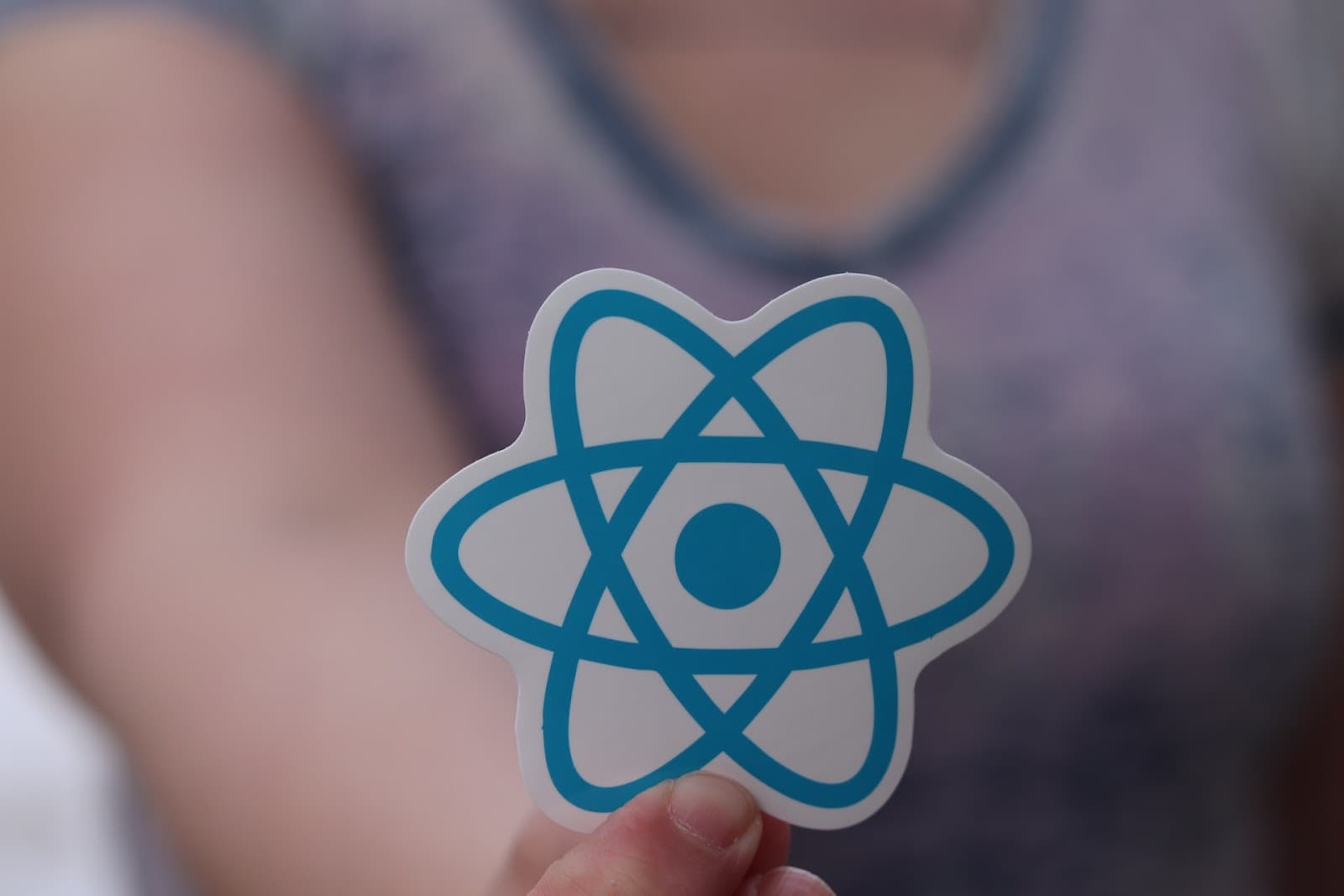
Is React the Right Choice for Your Project?
In the current digital era, user demands are at an all-time high when it comes to performance. Websites are expected to load instantly and react to any user […]
-

Traditional vs. Non-traditional Paths to Web Development: A Comparative Analysis
In the rapidly evolving digital landscape of today, web development has emerged as a critical skill. This brings us to an important question: “Is a Degree Necessary to […]